
Hot Tropic
The tropical color scheme for David Ogden and Anne Harkavy’s Balmoral family room was inspired by their home’s stained-glass front door—a wedding present from Harkavy’s parents. Playing off the door’s vivid colors, Arlington-based designer Andrea Houck introduced a bamboo-motif rug and drapery panels in an immense fruit-and-flowers print. With large picture windows spanning two walls, the 20-by-20-foot space (which Houck describes as a “giant glass box”) called for bold measures. “The window treatments are the glue that holds everything together,” she says.
Luxe accent pillows in complementary prints enliven a muted sectional sofa, while two orange leather chairs opposite the sofa kick up the color quotient. “We needed to be persuaded,” Harkavy says, “but now I really like how they pop in the room.”
Another unifying element is the 60-by-50-inch abstract painting in the adjoining dining area. A less assertive art choice would have gotten lost in the tableau, Houck says. “Big rooms need big pieces—big furnishings and big patterns. This room could accommodate the desired bright colors, too.”
Sunny-Side Up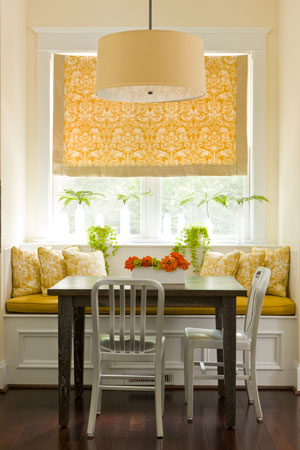
When Matt Collins purchased his house in Lacey Woods a few years ago, he wanted to freshen up the interiors but wasn’t sure where to start. “I know what I like when I see it,” Collins says, “but I don’t know how to pull it together.”
A single dad with two teenagers, he turned to D.C.-based designer Margaret Carter to create spaces that felt homey and happy.
The sunny breakfast nook, which adds a burst of color to the kitchen’s neutral black, white and charcoal finishes, is a prime example. Its citrus notes reference an adjacent room, where the same yellow covers two updated wing chairs. “I needed some color, and I could bounce off the family room, which is visible from the kitchen,” says Carter.
For continuity, Carter used the same upholstery on the nook’s bench-seat cushion, then added a Roman shade and throw pillows in a complementary damask-patterned fabric. The overall effect is just right for the cozy eating area. “It’s not fussy or too much of the same thing,” explains the designer. “It’s almost monochromatic in a fresh, contemporary way.”
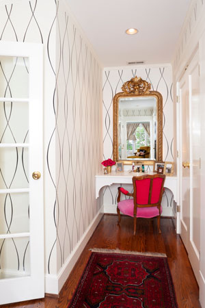 Touch of Glam
To get a sense of designer Sherri Pellegrino’s playful savoir faire, look no further than the dressing area in her Country Club Hills home—proof that even a small space can have a big impact. Graphic wallpaper paired with a traditional Turkish rug? Sure, why not.
A busy mother of two, Pellegrino says she wanted a pretty and practical space to start her day.
“The wall pattern’s large scale is significant but not overwhelming,” says the Arlington designer. “It doesn’t compete with the rug’s more ornate pattern.”
Rounding out the scheme, a feminine, “junk shop” chair, clad in two jewel-toned shades of velvet (Pellegrino says she couldn’t decide between pink and red, so she chose both), is juxtaposed with a high-gloss white vanity, which she made out of plywood and decorative corbels from Home Depot.
“You can’t go wrong with a black-and-white ground and touches of color,” she says.
Bright Spots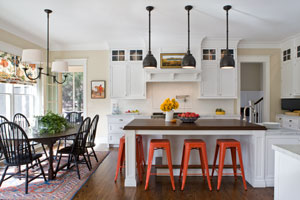
A self-described “Type A,” Madelyn Smith collected decorating ideas torn from magazines for years. This archive served her well when she and her husband, Dominic, purchased a newly constructed house in McLean’s Hansborough neighborhood and tapped designer Marika Meyer to inject personality into its builder-bland spaces.
A floral-print fabric served as the starting point for a lively kitchen design that befits a family with three small children. Tailored Roman shades on four windows show off the pattern’s exaggerated scale and organic shapes.
“The shades soften the kitchen’s hard surfaces,” explains Meyer. “But I kept the fabrication simple and let the bold pattern be the statement.”
To tie the room together, Meyer repeated colors from the shades elsewhere in the design. Indigo blue provides an unexpected lining inside glass-fronted white cabinets, while red-orange spray paint livens up a set of otherwise drab metal bar stools. “The space is supposed to be fun,” she says, “and the stools bring that energy.”
In a happy coincidence, a Turkish rug, taken from the entry hall of the owners’ prior digs, fit nicely under the kitchen table. “I love mixing colors and patterns,” says Smith. “But it’s a balancing act, getting it all to work together.”
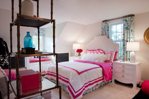 Sweet Dreams
A kitchen canister provided the unlikely inspiration for 13-year-old Courtney Johnson’s bedroom redesign in Falls Church. After spotting the canister in a shop on Martha’s Vineyard, she and her mom, Christie, asked McLean-based designer Roxanne Lumme to build a room with the same pink-and-turquoise color combo.
Like most teenagers, Courtney is social-media savvy, and she used Pinterest to kick-start the design process. “Courtney’s Pinterest pictures gave me a direction,” says Lumme. Then we found a [window] fabric that made her go ‘Wow!’ and things took off from there.”
Playing off that fabric—a pattern of gigantic white flowers on a teal background—Lumme added fuchsia elements for girly charm, plus black accents for grown-up gravitas. “Teal and pink are a happy combination, but I couldn’t let those two strong colors overpower the room,” she explains.
The end result is bold and fun. “All the pattern and color didn’t scare Courtney at all,” says her mom. Someday the teen aspires to become a fashion designer.
Design writer Catherine Funkhouser lives in Lyon Village with her husband and three children.