Building a house from the ground up is fairly straightforward. It’s more difficult to renovate an existing home—especially when the spaces are awkward or confined as so many old Arlington houses are—and even trickier to transform a traditional house into a modern one. But for these contemporary-minded couples, the effort was worthwhile. To them, modern design has an appealing elegance and unfussiness that counters all the density around them, while reflecting the times we live in. What’s a homeowner to do with a garden-variety colonial, rambler or split-level? See how these three homes went from drab to fab.
Rambler Redo
Sitting at his kitchen table, Parks Shackleford points to the steady flurry of wildlife visible through the large, nearly-floor-to-ceiling picture windows—squirrels, nuthatches, titmice, chickadees and other woodland creatures he can name easily. “A 10-point buck visits occasionally,” he says. “I see others on the trail cams.” He’s referring to the motion-sensing cameras he’s installed in the extensive woods around his nearly one-acre property.
Located at the end of a secluded street in Bellevue Forest, the 6,000-square-foot residence Shackleford shares with his wife, Julie Anna Potts, and their three kids is bordered by Donaldson Run Park on three sides. The location was ideal for this lifelong wildlife enthusiast, a sugar company executive who wanted an easy commute to his Washington, D.C., office. (Potts is an attorney and executive with the American Farm Bureau Foundation, also based in D.C., and former chief counsel for the U.S. Senate Committee on Agriculture, Nutrition & Forestry.) But the house, a 1970s rambler that the couple purchased in 1999, was somewhat unusually designed.
Unlike the older brick ramblers in the neighborhood (which are essentially rectangular boxes), the stucco home is bookended by large end sections capped with shed roofs. The previous owners had designed the house themselves. But despite its unusual look, it still felt cramped and compartmentalized inside—a common problem in ranch homes.
While Shackleford and Potts appreciated the original builder’s attempts at a modern aesthetic, many of the spaces were outdated. The kitchen was closed off from the family room, for one, and the guest bathroom awkwardly opened onto the dining room.
After living there a few years, the couple decided they wanted greater connectivity between the kitchen and the family room, and between the house and the outdoors. They turned to Washington, D.C.-based Lori Graham, a former lawyer and one-time colleague of Potts’ who had launched a second career as an interior designer.
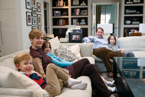
To make the existing space more functional and livable, Graham converted the home’s original garage into a guest bedroom, bath and home office, replacing the garage with a carport. A ladder from the office now leads up to an ingenious loft playroom for the couple’s three children (twin girls Ella and Olivia, 8, and a 5-year-old son, Duke), which overlooks the family room and kitchen. Reclaiming closed attic space and raising the ceilings to create the loft also allowed for a dramatic opening of the communal areas below.
Potts and Shackleford enjoy cooking and entertain often—both large and small gatherings of friends, family and business associates—so one of Graham’s charges was to create a more accommodating party environment. The kitchen, now double in size and open to the family room, features two dishwashers, two islands and plenty of circulation space.
In the more private areas of the house, the master bedroom suite was also expanded. An all-glass shower stall in the master bath offers uninhibited woodland views. The bath’s quiet palette of honed white limestone walls and blue stone floors complements the scenery.
For the décor, Graham was careful to take the couple’s differing sensibilities into account. Shackleford goes on safari by himself at least once a year, and the house features a dazzling menagerie of antlers and trophy mounts, none more so than a magnificently horned oryx mounted in the master bedroom. Thanks to Graham’s light touch, elegant wall coverings and sense of balance, the overall effect is like one of Georgia O’Keeffe’s classic Southwestern skull paintings, rather than a hunting cabin.
“Julie Anna likes glam, while Parks likes hides and horns, so taking into consideration both owners’ tastes, existing art and functional wishes played key roles in the overall design,” Graham says. “Julie Anna also favors Asian-influenced pieces, which complement Parks’ animal elements. Opening the kitchen to the family room made this space not only modern and chic, but also efficient and functional for a very busy family.”
Takeaways:
- In a long, narrow house, take opportunities to connect interior spaces, such as by adding a loft overlooking a family room or living room.
- Introduce as much natural light as possible with new windows and skylights, or by tearing down unnecessary walls.
- Use similar elements—wall coverings, sconces or other decorative pieces—to make disparate spaces feel more connected.
Designer
Lori Graham Design,
Washington, D.C.,
lorigrahamdesign.com
Kitchen Design
Aidan Design,
Bethesda, Md.,
aidandesign.com
Split Difference
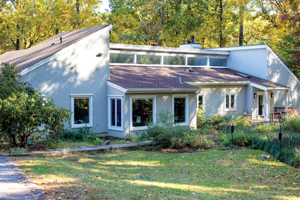
Split-level houses can suffer from a “neither here nor there” feeling, with foyers that feel like forgotten, in-between spaces. This was certainly true of the 1950s home of Joe and Layle Nelson, tucked at the end of a cul-de-sac in the northern portion of Broadmont in the city of Falls Church, just over the Arlington County line. With its large front yard, divided-pane windows, nondescript façade and utilitarian carport, the 2,600-square-foot house could not have felt more homogeneous. The front door opened right onto the split stair landing, with no porch or sense of arrival.
The banality of the entrance topped the list of things the Nelsons wanted to change in their recent renovation. After reviewing several firms, they commissioned D.C.-based KUBE Architecture to redesign the entrance, add a garage and open up a formerly closed-off kitchen and living room to better reflect the couple’s active, casual lifestyle.
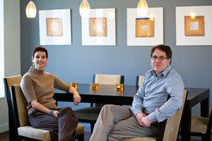
Joe, an environmental lawyer, and Layle, who runs grassroots campaigns, have no kids and travel often for business and pleasure, both domestically and abroad (including a trip to Africa last fall). At home, they enjoy cooking, gardening and throwing informal get-togethers for neighbors and friends. They like that their house backs up to Isaac Crossman Park. It makes for nice scenery while grilling on the back patio.
“We wanted to do something modern, but we always knew that we weren’t going to change the footprint,” Joe says. “It was much more about changing how we lived in the house.” They already had plenty of square footage for two people, he says. It just wasn’t well designed.
KUBE principal Janet Bloomberg was equally keen on keeping the project as sustainable as possible by using existing space wisely and not overbuilding.
Bloomberg’s first step was to create a sense of drama and arrival out front. Swapping out the old carport for a sleek garage (one that’s now connected to the house via an interior stair), she then popped out the front entrance to create a glass-filled foyer. The front door of this vestibule is now perpendicular to the plane of the house and opens onto a modest landing. A wooden fence and pergola partially enclose a forecourt, creating an interplay of light and shadow on the ground and garage walls. In the back, a squared-off, urban-style patio segues into landscaping that becomes more naturalistic as it stretches toward the parkland.
“We wanted to emphasize the idea of layering within the landscape,” Bloomberg explains. “The pergola design creates a simple, minimal enclosure for the walkway that casts interesting shadows and light around the yard throughout the day as the sun moves. The front fence is slatted to create a sense of enclosure for the front garden, while maintaining an overall feeling of transparency.”
Inside, Bloomberg and her team renovated the entire upper level of the house, opening up the kitchen and the living room, replacing the old divided-pane windows with larger spans of glass and enlarging the master suite, which is now cantilevered over the backyard.
The designers simplified and modernized the color scheme, juxtaposing industrial grays and metallic tiles with warm wood, earth tones and unexpected pops of color—such as a lime-green wall framing the master bathroom. Furnishings are spare but exacting; curtains in the master bedroom, for example, function on a nearly invisible inset track.
Joe Nelson credits the overall success of the project to Bloomberg’s ability to balance the big picture with the small details, all the way down to paint colors. His favorite aspect of the renovation, however, comes back to that entrance.
“I love walking into the entryway now,” he says. “In the morning, you have great shadows on the walls from the pergola. It’s just a really nice feeling.”
Takeaways:
- Enlarge the intermediate, in-between area of a split-level (usually the entrance) to make it more functional.
- Make forgotten, banal spaces more interesting by adding splashes of bold color in unexpected places.
- Consider enclosing an existing outdoor area, such as a carport or patio, to increase square footage without changing the original footprint.
Architecture, Interior Design and Landscape
Architecture
KUBE Architecture,
Washington, D.C.,
www.kube-arch.com
Contractor
HouseCraft, LLC,
College Park, Md.,
housecraftllc@earthlink.net
Colonial Conversion

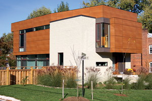
The first things you notice when you enter Todd Ray’s house in Milburn Terrace—aside from the fact that it looks almost nothing like its neighbors—are the three cocker spaniels zipping around like they own the place. Clearly they love the open floor plan and the wide glass doors that allow them easy access to a large side yard and garden.
It wasn’t always this way. Ray, an architect and principal of D.C.-based Studio Twenty Seven Architecture, recalls the problems he and his wife, Diane, encountered when they purchased the 900-square-foot, two-story colonial on a sixth of an acre in 1997. The spaces were confined and received very little light; they felt cut off from their garden, where they spend most of their time; and worst yet, they were always tripping over the dogs. These shortcomings gave Ray the motivation to redesign and expand his own digs, tapping into the expertise of his Studio Twenty Seven associates.
Achieving buy-in from the neighbors was a priority during the design phase, Ray says. Each time a major architectural decision was made, he communicated his intent, sometimes taking his plans door to door. The neighbors had questions and concerns about the building’s height—such as whether new windows would compromise their privacy by providing views inside their houses—but they were generally supportive, he says.
“Todd was very open throughout the process,” says neighbor Jim Davis. “On several occasions he brought his computer out to show us the design and explain what we could expect. It was fascinating to watch them transform a traditional colonial into such a unique home. It makes a real statement.”
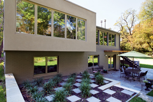
Today, the 2,800-square-foot house, with its cantilevered second story and minimalist exterior of gray and brown, stands out in a sea of red-brick-white-shutter colonials north of Lee Highway. For the addition, the couple retained most of the original brick structure but popped out the back to create a two-story atrium in the main kitchen/dining/family room. Once gutted, the interior was completely redesigned to fit the Rays’ specific needs. Near the front door, for instance, is a small room designed to hold bicycles (Diane, an economic development officer, bikes to her downtown job nearly every day).
Nature now enters the space in unexpected ways. Massive skylights and a new bank of windows on the addition make artificial light largely unnecessary during daytime hours. The windows also create a direct connection to the outside, framing carefully chosen views. For example, a charming upstairs corner window provides long sight lines up the street.
“The house is basically a perfect rectangle that we pushed and pulled apart for very specific site conditions that relate us back to our neighborhood,” Ray explains. “We have a masonry box [the original house], a glass box for the addition, and a wood box upstairs for privacy.”
Sustainability was another major goal. Ray designed the house in keeping with the U.S. Green Building Council’s LEED for Homes standard (it is expected to be certified platinum, the highest rating), the National Association of Home Builders’ sustainable checklist and the Arlington County Green Home Choice program. Green features include a geothermal heating and cooling system, energy-efficient lighting and an indoor air quality flushing system. “My electrical bill is the same or less than it was in the original house, but with almost triple the space,” he says.
On the aesthetic side, Ray is developing a railing for the interior stair that he describes as an abstraction of the maple trees outside. To design it, he took a picture of sunlight filtering through leaves and scanned the image to create a pixelated mosaic. He is now having the image converted into a translucent resin panel (the current stand-in is a temporary wood model) which he hopes will bring that same ethereal, flickering light quality into the space. “The house is an ode to the maple trees,” he says—albeit an abstracted one.
Why modern in a land of colonials? Ray says his penchant for minimalism is a nod to the times we are living in. “The houses most seen in Arlington were designed in the era of World War II,” he says. “[Back then], the family, life sensibilities, social and global conditions were drastically different. Our notions of the environment were different. Modernity is where we are right now and we are designing and living in the present.”
Takeaways:
- Consider enlarging windows or repositioning window openings to take advantage of sunlight patterns and streetscape views.
- The first story of a typical colonial is elevated to allow for a basement. Stepping down an addition to ground level can increase connections with the outdoors.
- Maximize physical and psychological space by removing walls and opening interior stairways.
Architect
Todd Ray, Arlington,with Studio Twenty Seven Architecture,
Washington, D.C.,
www.studio27arch.com
Contractor
Phelps + Phelps
Consulting,
Rockville, Maryland,
www.consultpp.com
Kim O’Connell is a freelance writer and a proud resident of Arlington’s Aurora Highlands neighborhood. Her work has appeared in National Parks, The Atlantic Cities, Architect, Preservation, The Washington Post and Washington Business Journal.