
In 1998, architect Sarah Susanka published The Not So Big House, the first in a series of groundbreaking books challenging America’s “bigger is better” mentality. Her thought was to show (and not just tell) how relatively small homes with thoughtfully designed spaces could feel every bit as luxurious as bigger abodes with plus-size floor plans.
We decided to ask a handful of local architects and designers to do the same, sharing some of their best maneuvers for making little spaces shine. Whether you are building a new home, renovating a petite postwar dwelling, or nesting in a high-rise condo or apartment, here are some ideas for living large when space is tight.

Embrace the Dark
Once upon a time, the conventional wisdom was to avoid dark colors in small spaces for fear of making them feel closed in. On the contrary, says designer Cindy Eyl of Arlington-based Jefferson Street Designs. Rich colors and fabrics can impart a sense of coziness. Tucked inside a home in Yorktown, this sumptuous little “snug” room was inspired by the owner’s British mum. “In England they just call it a snug,” Eyl says. “It’s a small, dark, comfortable space, kind of like a library, with oversize furniture.”
To complement the crushed velvet sofa and a leather chair from 1stDibs, Eyl painted the entire room a deep teal (Benjamin Moore Newburg Green), including the baseboards, molding and existing built-ins. Against those rich walls, carefully selected paintings really pop. “The owner is a fine arts appraiser at Weschler’s Auction House,” Eyl says, “so she has amazing art.” A slender cocktail table by Woodbridge Furniture provides a perfect little perch for a nightcap.

Interior designer Nicole Lanteri isn’t afraid of the dark, either. “Choosing paint colors and wallcoverings is more about the quality of light in the room than the size of the room,” says Lanteri, who lives in Arlington and has a studio in D.C. “This may sound counterintuitive, but dark can sometimes feel bigger because it gets rid of the corners in a room. It has a softening effect.”

Play With Patterns
An avowed maximalist, Lanteri maintains a similar philosophy about wallpaper (which, if you haven’t heard, has made a roaring comeback). “People think having it on all the walls is too busy, so let’s just do one accent wall. I disagree,” she says. Doing a full 360 “has a ‘wow’ factor and softens the corners in the same way as dark paint, so that you aren’t fixating on the room’s dimensions.”
Plus, she says, “in a smaller space, there are often lots of necessary dribs and drabs on the wall—HVAC vents, light switches, a TV. Wallpaper or dark paint can smooth those things out to read as one large wall instead of seeing lots of bits and pieces.”

Want to make a big statement? Try coordinating wallpaper and upholstery in the same pattern, as in the above kitchen. “This house is small like my house in Arlington,” Lanteri explains. “They did a renovation that left an odd little spot in the kitchen that was too small for a dining room table. Our solution was this little tete-a-tete. They have two kids, and each has a drawer under the bench seating to throw their stuff in.”
The banquette for two features a pattern from Schumacher’s Chiang Mai Dragon line. “We blended the walls with the cushions so it all feels like one large piece,” she says. “A contrasting fabric would have made it look smaller,” whereas the continuation of the pattern has an elongating effect.
In the bedroom of her own center-hall Colonial in Ashton Heights (see image at the top of this story), Lanteri used a photorealistic wallpaper by Deborah Bowness to create a trompe l’oeil effect that counterbalances the room’s low (8-foot) ceilings. “We went high with a 63-inch headboard from Room & Board, and vertical drops of wallpaper on either side,” she says. “I did a fun color because it has some gravitas to it. When you walk in, it feels like a big room, but it’s not.”
The simple nightstands from Design Within Reach are the same height as the mattress. That’s by design. “I like that they have no hardware,” she explains. “That way your eye stays level with the bed and isn’t drawn downward.”

Think Vertical
Need more space? The solution may be to stack and go up, says Kelly Holland, owner of KPH Studio in Arlington. Those bare walls could be working harder for you.
Take this 180-square-foot communal zone (above), designed to accommodate the laid-back leanings of an Arlington family of five. It adjoins the kitchen, serves multiple functions and puts many of the owners’ favorite possessions on display. A corner banquette with seating by Flowers Upholstery in Fairfax accommodates breakfast hour, kids doing homework and neighbors stopping by for drinks.
“We asked a lot of this room and it delivers,” Holland says. “It serves as a dining room, bar, library and lounge. They have a very casual lifestyle. Their front door is always open. There’s always stuff going on in there.”

At 9 feet, the ceilings aren’t unusually high, but Holland’s design makes them feel taller. Vertical storage for books, collectibles and barware essentially “wraps the room” in shelving.
Introducing built-ins actually solved some minor design problems, she shares. “By adding architecture, we were able to ignore or make sense of some awkward parts of that front room, including an odd bump-out.”
Floor-to-ceiling curtains further accentuate the room’s verticality: “With drapes, I like to extend them all the way up beyond the window casing. It’s like the difference between slouching and standing up straight.”

Custom built-ins also play a starring role in this Tiny Tudor remodel by Lee Design Studio in Falls Church. “The husband is a music teacher with an extensive vinyl collection,” explains principal Matt Lee. “For this music room, we designed shelves that are exactly the right depth for records and a dedicated area for a turntable. The whole room is about 100 square feet.” For continuity, the pastel palette harmonizes with the colors in an adjoining family room.
Big windows with sightlines to the outdoors make the interiors feel larger, Lee adds. “We have natural light pouring in from everywhere.”

Splurge a Little
Who doesn’t love a touch of luxury? Small spaces are ideal spots for treating yourself to upgrades like high-end upholstery, designer wallpaper and fancy tile because those finishes are only needed in small quantities.
This jewel-box home in Arlington Forest is a lovely example. “In the dining room, we added a Schumacher silk wallpaper to the backs of the existing built-ins,” says Eyl of Jefferson Street Designs. “It’s pricey, but we didn’t need much.”
The dining chairs feature a performance fabric on the seats and a higher-end Thibaut pagoda pattern on the backs. “The chinoiserie backs are the fun part,” Eyl says. “We used an upholstery company in D.C. and ordered our own fabrics.”

In the living room (above), the owners sprung for a custom console table wrapped in grass cloth and upholstered benches that tuck underneath when not in use. “Other consoles were either too big or too small,” Eyl says. “This allowed us to maximize the space with exact dimensions” and furniture that doesn’t impede traffic flow.

“The x-shaped benches under the console are something we do a lot in Arlington houses that are cute and charming,” she adds. “You can pull them out for extra seating. This client entertains a decent amount and uses them often. She has great taste and actually ended up working for me.”

Reconfigure It
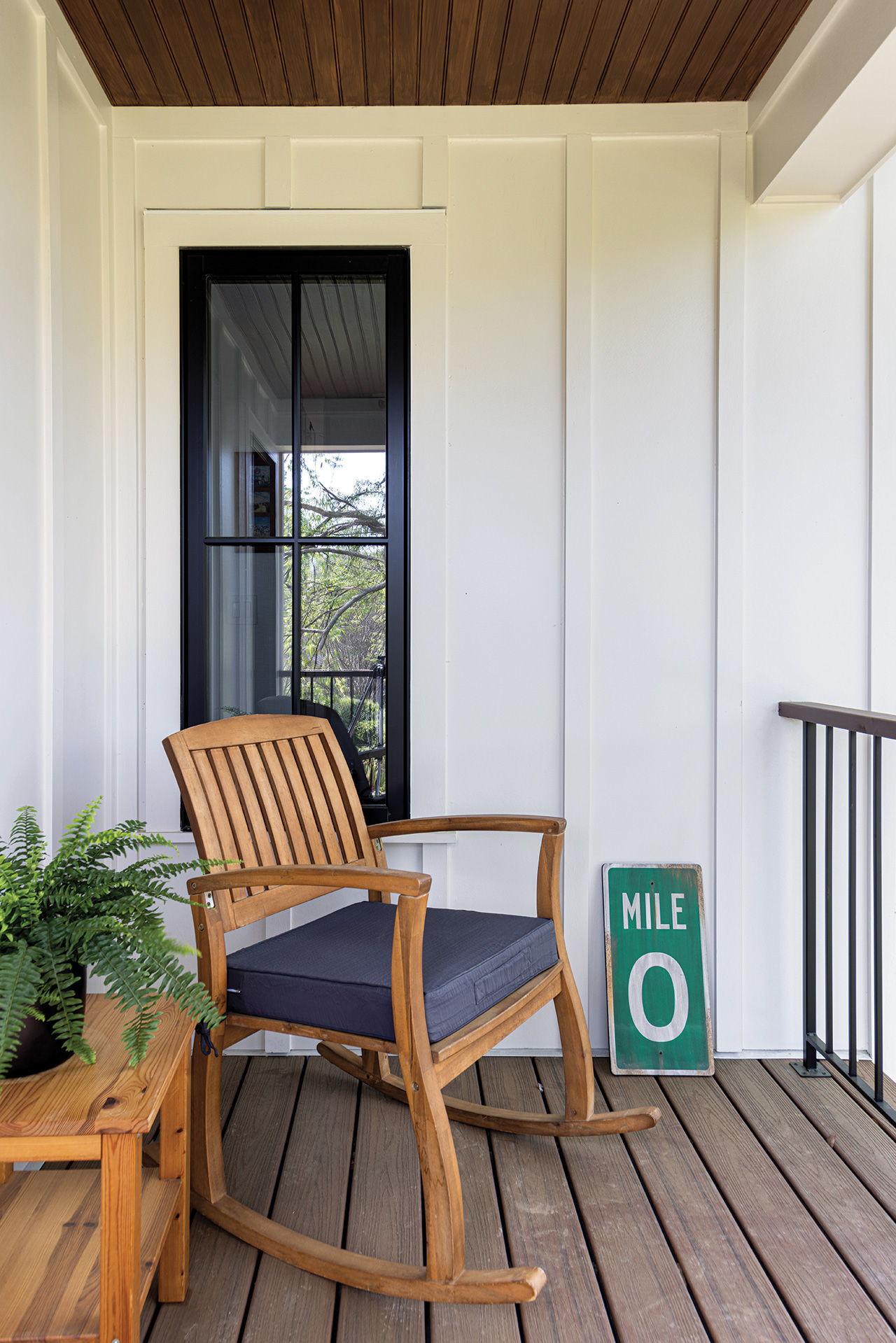
Do you have dead spaces in your floor plan that could be put to better use? If so, you may already have the real estate you need for that lifestyle upgrade you’ve been dreaming of. The original layout of this home in Donaldson Run (above) had an awkward back deck sandwiched between the dining room and the primary bedroom. “We considered fully integrating it into the interior,” says Hannah Burkholder, marketing assistant with TriVistaUSA Design+Build, “but ultimately, the clients liked the idea of transforming it into a sunroom.” Now the 133-square foot space is a screened porch that connects to nature while also bridging the public and private parts of the house. And it gets a lot more use.

Wall cavities can also have untapped potential. As part of this basement retrofit in Arlington’s Woodmont neighborhood, TriVistaUSA Design+Build transformed two awkward closets under the stairs into a tidy niche for appliances. Now, a stacked washer-dryer and a wine fridge sit side-by-side, with a custom built sliding barn door that hides the laundry when not in use. The wine storage puts bottles within reach of a lower-level bar and entertainment space, says principal Michael Sauri.

While remodeling their home in Alcova Heights, the owners of this popped-up Cape Cod found themselves wishing for more deck, but they didn’t want to expand the footprint of the house. Working with architect Tripp DeFalco and Alair Homes, they decided to sacrifice a little bit of interior square footage to add a 6-foot-by-8-foot porch off their second floor bedroom.
DeFalco’s design literally carves a block of open-air space out of the rectangular volume of the house.

Clear Things Up
When your canvas is a 430-square-foot studio apartment, every design choice carries weight. To minimize visual clutter in this tiny Crystal City condo, Carrie Armstrong of Lapis Ray recommended a translucent glass console table and Lucite café chairs.
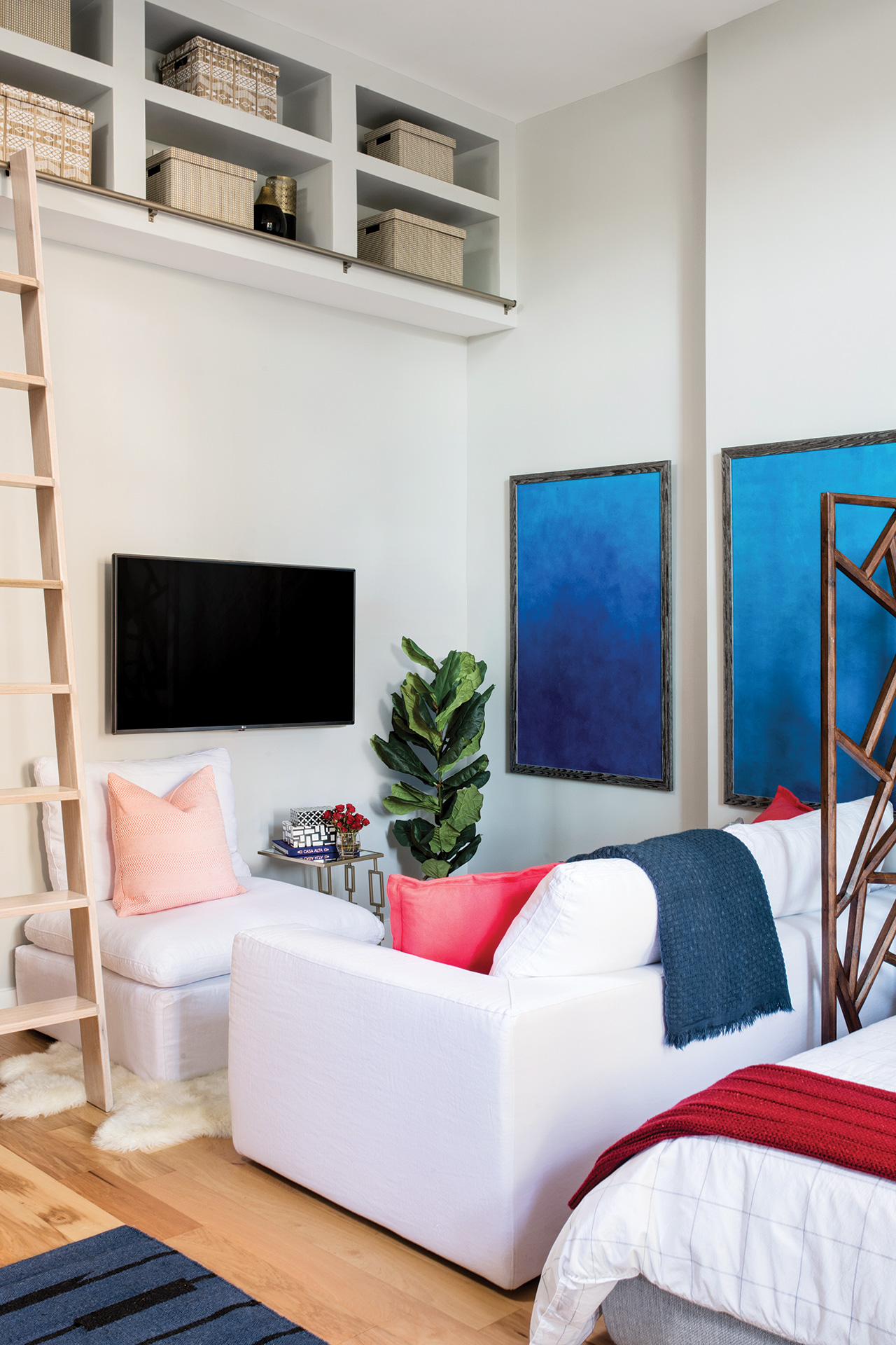
White furnishings exude calm, and a library ladder provides access to loft storage above the sitting area. “Whatever the size of the home, we like to create these vignettes—little pockets of joy—centering on objects that have meaning,” Armstrong says. “For this client, the art was important and intentional.” The abstract panels of cerulean blue offer soothing bursts of color therapy.

Edit With Intention
Personalization is a critical element in good design, says Samara Goodman of Samara Interiors, no matter how large or small your place may be. This Shirlington apartment showcases family heirlooms such as a sled and sleigh bells (repurposed as wall décor), a vintage ice box (now a storage cabinet) and a hand-crocheted likeness of the owner’s childhood home in Ohio, which Goodman framed and hung next to the bed. “It’s an uncluttered space with meaningful objects and multipurpose furnishings,” says the Arlington designer.
In the living room, Crate and Barrel ottomans can be used as coffee tables or seating, and the cubes have storage space inside. An armless slipper chair maintains a low profile, and the sofa has a pull-out bed for visiting family. Drapes spanning the full length of the back wall make that wall feel bigger, with black hardware that “draws the eye up,” Goodman says.
The area rug is made up of carpet squares from FLOR. “What I love about this product is that it’s affordable, durable and can be customized to fit any space,” she adds. “The squares can even be reconfigured and reused if needed.”

For cohesion, Goodman went with a neutral color palette with warm accents in her client’s favorite colors. In the bedroom, she counterbalanced the heavier case goods—including a dresser her client already owned and a queen bed with built-in storage drawers underneath—with more delicate accessories such as a slender floor lamp and a side table with tapered legs. “You don’t want every piece to be a block,” she advises.
The nightstand was a $25 score that Goodman fixed up by tightening the joints, painting the drawer a contrasting color, and replacing the hardware with a fun knob from Anthropologie.

Balance Your Scale
Keep in mind, small spaces do not necessitate Lilliputian furnishings. When in doubt, Lanteri advises, it’s always better for art, furniture and light fixtures to be too large than too small.
“People say, ‘Oh, I need smaller furniture.’ Nope. You actually need to use every square inch of the space. If the wall is 84 inches, do an 82-inch sofa. Fewer, bigger things work really well in a small space, versus more smaller things, which just make it feel cluttered.”
And if your house has a few odd alcoves, landings and cubbies that defy conventional measurements? Lean into them and have fun, she suggests. “All the nooks and crannies make a house feel like home. Quirky spaces bring the magic. Even in a larger home, you need smaller, human-scaled spaces to ground you.”
Jenny Sullivan, editor of Arlington Magazine, is a former architecture and design writer who loves pictures of pretty houses.